
“Arrest”, “A Bigger Splash”, “The Fight Between Carnival And Lent” - titles for artworks are largely about interpretation; they provide a framework in which the artist or photographer wants the viewer to experience the results of their creativity. Titles can be very descriptive, or not descriptive at all.
If you’ve taken a look at my work, you may have noticed that my art, the stuff I do on canvas or paper, is named. Each work has a title. On the other hand, my photos do not. Why is that?
When I was younger, seeing photographs with titles just seemed wrong. Artworks had titles, yes, but photos? Certainly all the photos by photographers who I admired didn’t. They sometimes had captions – places, dates, possibly the simplest of descriptions of the content or subject of the photo, but not a title. If there was anything, it was simple and factual. No creative, conceptual, or abstract string of words. I didn’t really think critically about it at the time, but the captions seemed to add some sort of authenticity or legitimacy to photographs, and perhaps that hinted at the struggle which photographers have had over the decades to get their work accepted as a serious creative statement, rather than a simple record of an event. Of course, there’s also the argument that providing only factual information will allow the viewer to form their own opinion of the content of the photo; they’re not being dictated to by anyone.
Many years ago when I worked for the Civil Aviation Authority, I once took part in the annual staff photographic competition. As it happens, my entry was of an aircraft, but many other entries were not aviation related at all. The one that sticks in my memory does so not because of the subject, but because of the title it had been given. The subject was a canal boat on a canal in an industrial landscape, maybe in the Midlands, and on the water were a number of ducks or possibly geese, but nothing more regal than that. And the title it had been given? Swanee River. I mean, really? The composition was quite attractive, the printing was good, overall it was an effective photo – in every respect except for that ridiculous title. The problem for me was simple; firstly, there were no swans, and secondly there was no river (it was a canal, not a river!). I could imagine the little laugh the photographer had had when he gave the photo that title, but for me it was no laughing matter. It was all wrong, it just wasn’t serious. Maybe I was being a bit too serious myself for thinking like that, but it just didn’t fit. It completely ruined my experience of that image, and instead all I could think about was how ‘bad’ and inappropriate the title was.
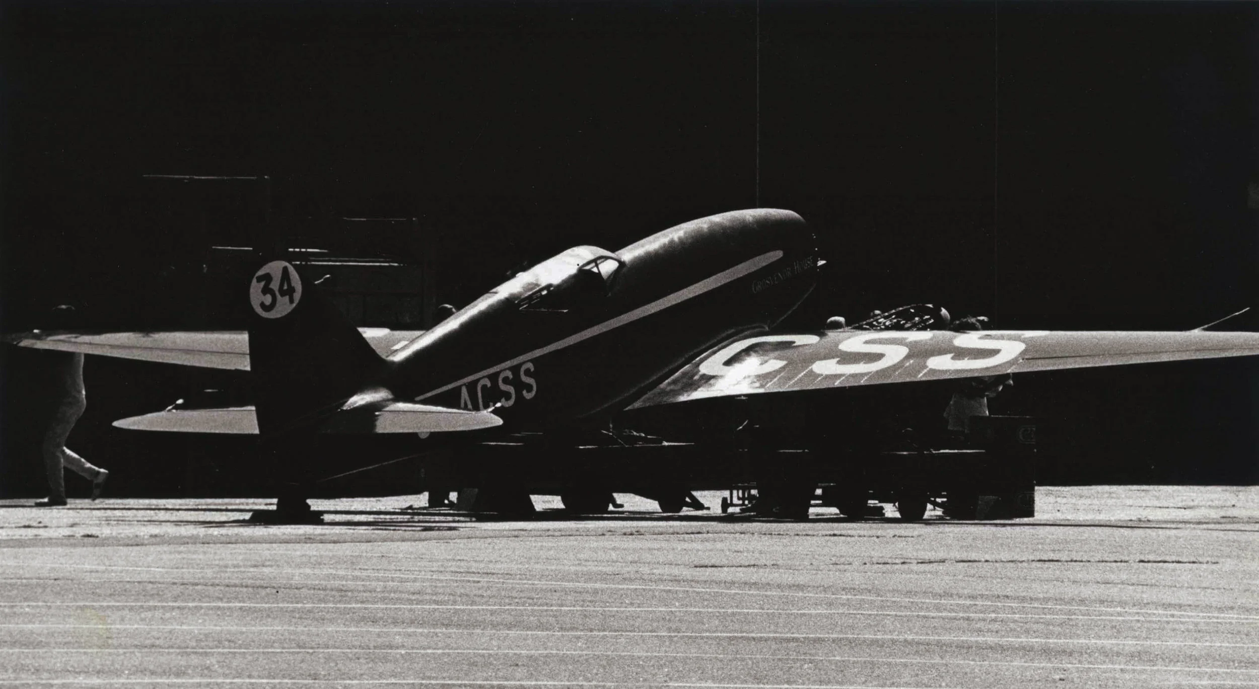
De Havilland DH88 Comet racer, Hatfield Airfield, 4th Juy 1987
This is a scanned copy of the black-and-white print that I entered into the 1988 Civil Aviation Authority staff photo contest, the one where I came across the photograph mentioned in the text titled “Swanee River”…
So, perhaps that one small event has coloured my approach to titles for my photos, but the desire remains for me to keep it simple and to let the viewer decide – 99% of my photos will have nothing more than simple descriptive captions. Perhaps if I decided to make photographic images that were more conceptual and abstract my opinion might change, but for now the caption is king.

Atomic Weight
One of my artworks - with a title! The title may actually mean nothing to most, but perhaps it’s intriguing at the very least? I wouldn’t expect anyone to guess, but the title refers to the fact that the division between the two blocks of colour in the artwork is based on the ratio of the atomic numbers of silver and gold. The viewer doesn’t know this, but I do, and when I’m creating art like this having something to control the decisions I make with regard to the composition and so on adds meaning to the process.
But; what about the titles I give to my artwork? I suppose that, because the results of my art practise are just SO abstract, a simple caption doesn’t make sense, so I usually give the piece a name. It doesn’t have to mean anything to anyone but me, and in fact, it probably won’t, but that’s the very reason why I think it works. Although the artworks I make are indeed abstract, I do have an idea or a concept in mind when I’m planning and making them, and it’s possibly for that reason that I feel it’s OK to nudge the viewer in the direction that I was taking when I made the piece. At the same time, it still leaves plenty of room for the viewer to make what they will of the work. Perhaps it helps, perhaps it doesn’t, or maybe it even suggests a different direction for the viewer to take for themselves, but that’s fine by me.